|
|
|
|
|
|
|
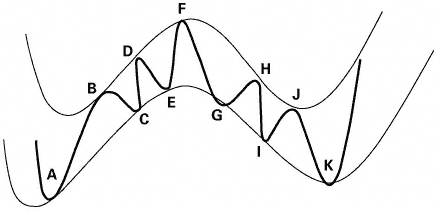
Neal: Your diagram looks a little complicated. |
|
|
|
|
|
|
|
|
Don: Well, at first it does, but look closer. The outer band represents a larger cycle, compared to a cycle of shorter length. This might be a cycle of an hourly inside the cycle of a daily chart. It also could be a cycle of a 10-minute chart within an hourly chart, or it might be a one-minute chart within a 10-minute chart. |
|
|
|
|
|
|
|
|
A very aggressive day-trader will be looking at the one-minute chart, hoping to catch a very quick move of only a few minutes and only a point or two of profit. He needs to compare the cycles of the one-minute chart to the cycles of the 10-minute chart. |
|
|
|
|
|
|
|
|
A less aggressive trader might be looking for only two or three trades a day. He would probably look at the 10-minute chart and compare it to an hourly chart. |
|
|
|
|
|
|
|
|
An even longer-term trader might use the hourly compared to the daily to make two or three trades per week. A stock investor might use the daily compared to the weekly, or even the weekly to the monthly, to time stock trades. |
|
|
|
|
|
|
|
|
The point is that you should know where you are on the larger cycle, even while you are trading a smaller cycle. You should be looking for buy signals at points C and E. You should be looking for sell signals at points H and J. You must be extremely careful if you try to buy at points G and I, or sell at |
|
|
|
|
|